Your Website’s New AI Coworker: Are You Ready?

Most conversations about AI and websites focus on one of two things: how AI is changing search results, or how businesses can use AI tools to save time. Both are worth talking about. But there’s a third angle that often gets overlooked and it’s the one that actually determines whether your website grows your business or just sits there looking pretty.

It’s not about whether your website uses AI. It’s about how well your website and AI work together.

Think of it like hiring a new employee. You wouldn’t hand someone the keys on day one without onboarding them, setting expectations, or giving them the right tools. Yet that’s exactly what most businesses do when they bolt on a chatbot, add an AI plugin, or let an automated tool tinker with their content. The result? A disjointed experience that frustrates visitors instead of converting them.

Let’s talk about what a well-integrated AI-powered website actually looks like, and why getting there requires more than just flipping a switch.

The “AI Layer” vs. the “AI Foundation”

There’s a big difference between layering AI onto a website and building a website with AI in mind from the start.

A layered approach might look like this: you have a WordPress site, and someone suggests adding an AI chat widget. You install a plugin, connect it to a third-party service, and now there’s a little chat bubble in the corner of every page. It answers basic questions — sometimes correctly, sometimes not — and nobody’s quite sure if it’s helping or hurting.

An AI foundation looks different. It starts with questions like: What are the most common reasons people visit this site? Where do they get stuck? What information do they need before they’ll pick up the phone or fill out a form? Then, AI tools are designed around those specific behaviors — not dropped in as an afterthought.

For example, a local service business might integrate a custom AI assistant that’s been trained on their actual services, service area, FAQs, and pricing structure. Instead of generic answers, it gives real ones. That’s a meaningful difference in user experience — and in the number of leads that turn into customers.

What “Working Together” Actually Means

When a website and AI are genuinely integrated, several things happen simultaneously:

The site gets smarter over time. AI tools can analyze how visitors move through your pages, which content gets engagement, and where people drop off. That data feeds back into design and content decisions — not in a generic way, but in ways specific to your audience. This is something we explore in depth in our post on how to transform your website to work smarter with AI solutions.

Content stays relevant without constant manual updates. For businesses that rely on managed WordPress hosting, this is a meaningful upgrade. AI-assisted content tools can flag outdated pages, suggest updates based on search trends, and help maintain the kind of fresh, authoritative content that search engines reward.

SEO works with the AI ecosystem, not against it. This is increasingly important. As we covered in SEO in the Age of AI: How to Stay Visible When Clicks Decline, AI-driven search is changing the way people find information. Sites that are structured for clarity, depth, and authority are the ones that get surfaced — whether in a traditional search result or an AI-generated answer. A well-integrated site makes both possible.

Custom programming makes it seamless. Off-the-shelf plugins can only take you so far. When AI needs to talk to your CRM, your booking system, your inventory database, or your customer support workflow, you need custom-built connections. That’s where thoughtful programming turns an AI feature from a gimmick into genuine infrastructure.

A Quick Reality Check

Here’s something we say to our clients often: AI is only as useful as the system it’s plugged into.

A chatbot connected to a poorly organized website will give confusing answers. An AI content tool working with thin, generic copy will produce more thin, generic copy. An automated SEO tool without human oversight will optimize for the wrong things at the wrong time. As we wrote in AI Can Support Your Website, But It Can’t Replace Real Expertise, the human layer — strategy, judgment, context — is what makes the difference.

This is why the “AI coworker” metaphor matters. A great coworker makes you more effective. A poorly onboarded one creates more work. The same is true here.

Where to Start

If your website is running on WordPress and you’re not sure where AI fits in, start small and specific. Pick one friction point, maybe it’s answering the same five questions your sales team gets on every call, or helping visitors find the right service page faster, and build toward solving that one thing well.

From there, the foundation for something smarter is already in place.

The businesses getting the most out of AI-integrated websites aren’t the ones who’ve added the most AI features. They’re the ones who’ve been thoughtful about which problems they’re actually trying to solve — and who’ve built (or partnered with someone to build) a system that fits.

That’s the difference between a website that works and one that works with you.

Ready to find out what a well-integrated AI approach could look like for your site? Let’s talk.

Web Accessibility: 8 Best Practices to Meet ADA & WCAG

Most businesses understand that website accessibility matters. But here’s the reality:

Accessibility isn’t a one-time fix. It’s something you maintain.

As your website evolves—new pages, new images, new content—it’s easy for accessibility standards to slip without even realizing it. And while tools and plugins can help, they don’t replace thoughtful, ongoing practices.

In fact, as we explored in our recent post on Digital Accessibility: Why Website Plugins Aren’t Enough, relying solely on automation can leave significant gaps in your user experience.

Think of your website like a building. The accessibility ramp, the wide doorways, the elevator — those get installed once. But if someone parks a delivery cart in front of the ramp every week, the building stops being accessible. Your website works the same way. Compliance requires consistent habits, not just a one-time setup.

The good news? The habits themselves aren’t complicated.

8 Simple Accessibility Best Practices You Can Apply Today

Accessibility isn’t just about compliance, it’s about usability for everyone. That includes:

  • Users navigating with screen readers
  • Visitors on mobile devices
  • People with visual or cognitive differences
  • Anyone trying to quickly find information

Here are the key areas to focus on when updating your website:

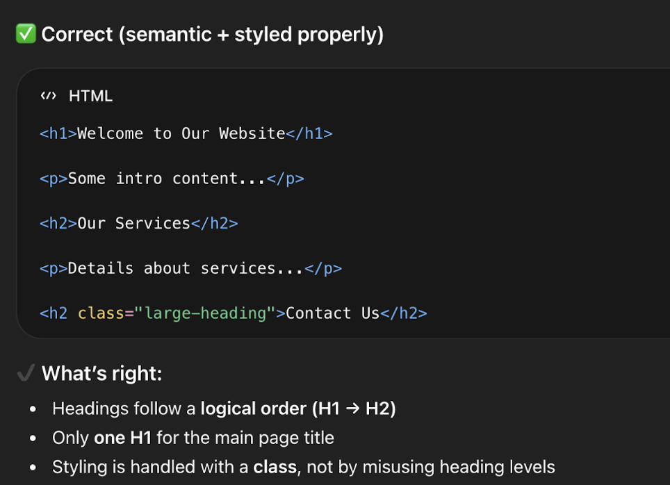
1. Use Clear Heading Structure

Screen readers and search engines both rely on your heading hierarchy to understand what a page is about and how it’s organized.

  • Use one H1 per page (your main title)
  • Use H2s and H3s to organize sections
  • Avoid skipping levels (e.g., jumping from H1 to H4)

👉 Think of headings like an outline, not just styling.

Correct heading structure for SEO and ADA

2. Color Contrast: Make Sure Your Text Is Easy to Read

Accessibility guidelines require a minimum contrast ratio between text and background. This matters most for users with low vision or color blindness, but — if you’ve ever tried to read grey text on a white background on a bright day — you know it benefits everyone.

The most common places contrast slips: link colors on colored backgrounds, button text, footer copy, and text overlaid on images. Any time you update your color scheme or add a new banner, run it through WebAIM’s Contrast Checker — free and takes ten seconds.

Even subtle color changes can make a big difference in usability.

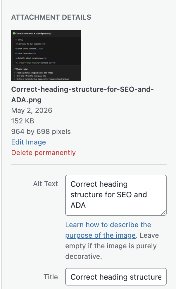
3. Add Meaningful Alt Text to Images

Alt text is the description attached to an image that screen readers read aloud. It’s also what search engines index when they can’t “see” your images — making it both an accessibility and SEO win.

Good alt text describes what the image communicates, not just what it shows:

  • Good: “Download the 2024 grant application form”
  • Not helpful: “Image of form”
Alt text on images

4. Use Descriptive Text Links

Screen reader users often navigate a page by jumping between links. If every link says “Click here” or “Read more,” that navigation is meaningless.

Descriptive link text also matters for LLM-driven search: AI tools indexing your site use link text as signals for what a destination page contains. “Download our services brochure” gives far more context than “click here.”

Easy upgrades:

  • “Click here” → “View our web design services”
  • “Read more” → “Read our guide to ADA compliance”

Clear links improve both accessibility and SEO performance.

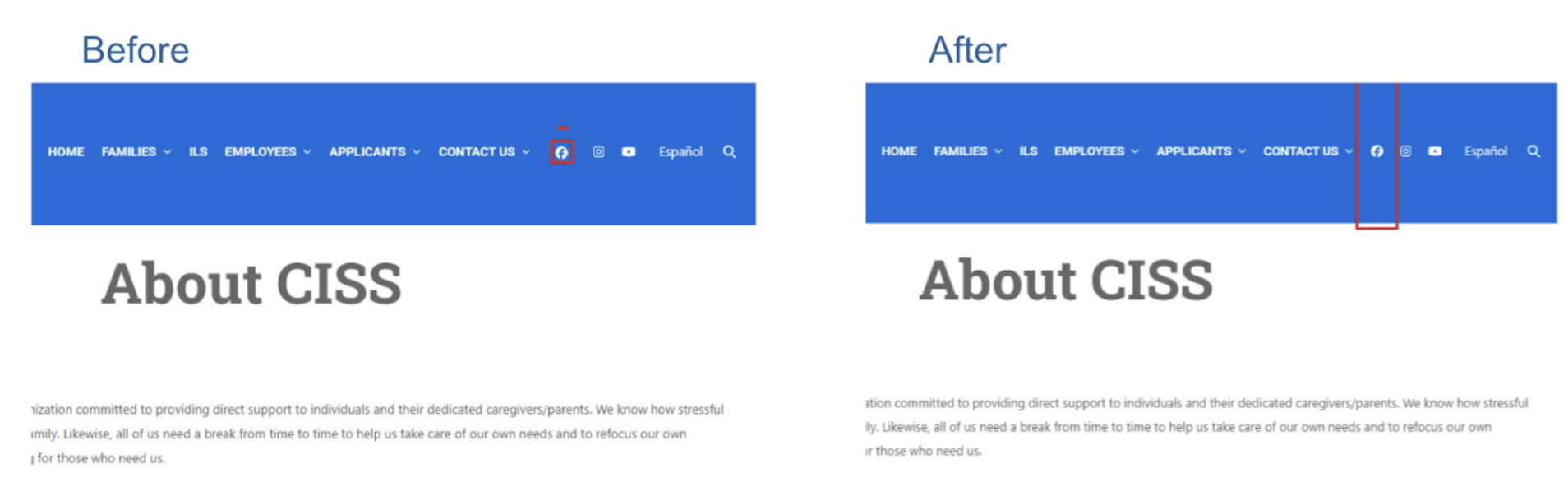
5. Make Buttons Easy to Click

Small buttons and tightly packed links create friction for users with motor disabilities, older users, and anyone on a phone. WCAG guidelines recommend interactive elements be at least 24–44px in both dimensions, with enough spacing between adjacent links that they aren’t accidentally triggered.

A button that looks fine in a mockup can be a tapping nightmare in real life. Worth a check any time you add new calls-to-action.

This improves usability for both desktop and mobile users.

Target size for buttons - ada best practices

6. Label Your Forms Clearly

Forms are one of the most common accessibility failure points — and the issue is almost always the same: placeholder text inside a field used instead of an actual label.

Placeholder text disappears the moment a user starts typing. Anyone who pauses mid-form, or who uses a screen reader, loses all context. Every field needs a persistent, visible label — whether that’s a contact form, checkout page, or newsletter signup.

Related read: If your site handles sensitive data, How to Make Website Forms HIPAA Compliant is worth a look alongside this one.

7. Keep Your Layout Consistent Across Pages

Navigation that changes between pages, shifting headers, and layouts that behave differently in unexpected ways all create disorientation — especially for users with assistive technology who build mental models of how a site works.

This tends to surface when teams create custom landing pages with unique structures, or when multiple people manage different sections of a site. If you have multiple contributors, make sure everyone’s working from the same structural template.

When things move unexpectedly, users can get lost quickly.

8. Don’t Forget About PDFs and Documents

Accessibility doesn’t stop at your website. If your site links to downloadable PDFs or Word docs, those files need to be accessible too. That means using proper heading styles when creating the source document and exporting in a way that preserves structure.

A PDF that’s just a scanned image, or one where headings were faked with bold text, will be unreadable to a screen reader. Review linked documents the same way you’d review a web page.

When uploading documents:

  • Use proper heading styles
  • Structure content clearly
  • Export as accessible PDFs

This ensures all your content—not just your pages—is usable.

Accessibility + SEO + AI Search: Why This Matters More Than Ever

Accessibility best practices don’t just help users—they also help your visibility.

Search engines and AI-powered tools (like ChatGPT, Google AI Overviews, and voice assistants) rely on:

  • Clear structure
  • Meaningful content
  • Well-labeled elements

In other words:

👉 Accessible content is easier to understand—and easier to surface in search results.

If your site is structured properly, it’s not just more inclusive—it’s also more discoverable.

The Bottom Line: Small Changes, Big Impact

You don’t need to overhaul your entire website to improve accessibility.

By consistently applying these small best practices, you can:

  • Improve user experience
  • Reduce risk
  • Support a wider audience
  • Strengthen your SEO and AI visibility

And most importantly—you create a website that works for everyone.

Need Help Keeping Your Site Accessible?

Accessibility can feel overwhelming, especially as your site grows. At NDIC, we help businesses:

  • Audit and improve accessibility
  • Implement best practices the right way
  • Maintain compliance as content evolves

If you’d like a second set of eyes or help implementing any of these updates, we’re here to help.

👉 Contact us today and let’s make your website more accessible, usable, and future-ready.

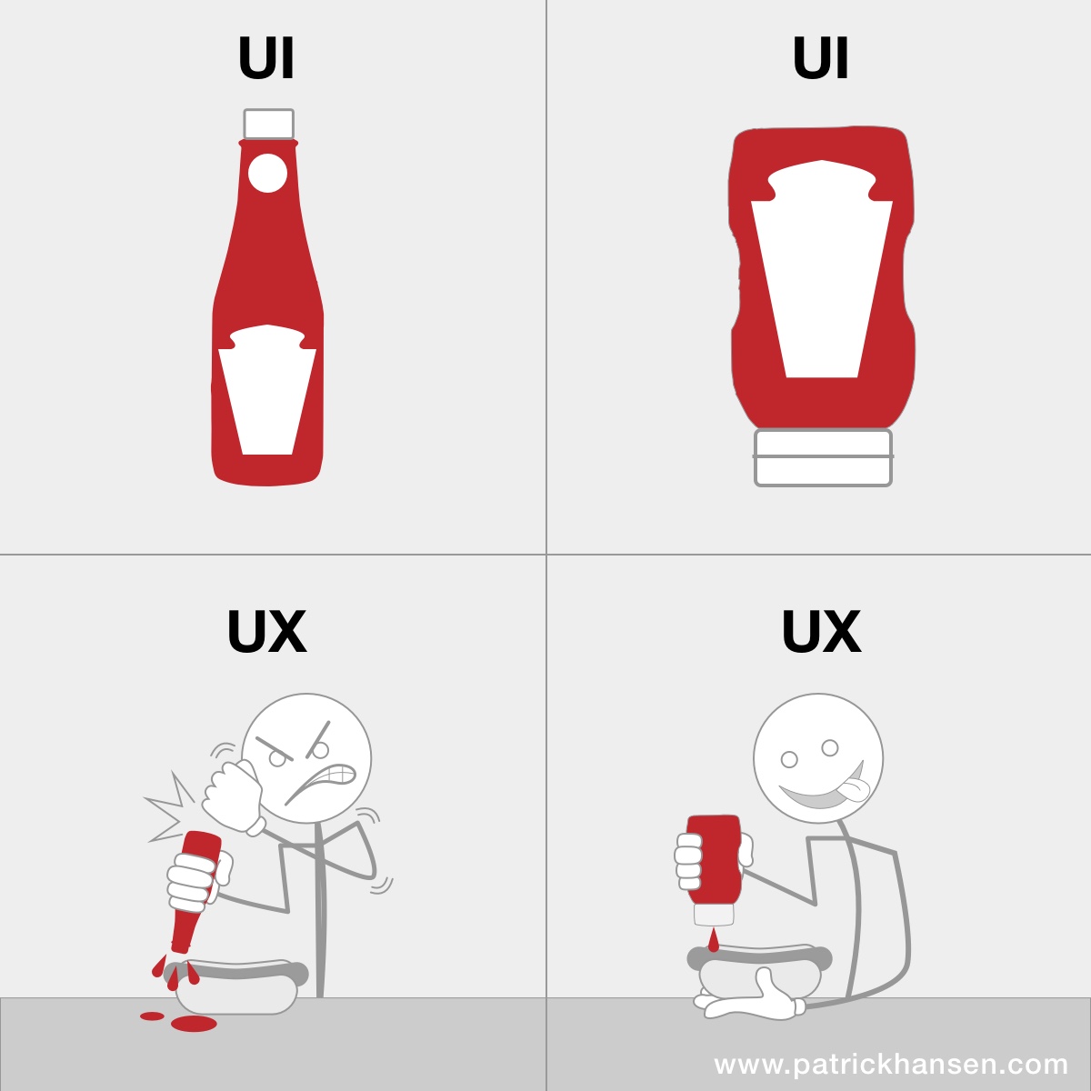
UX vs UI: What’s the Difference (and Why It Matters)

If you’ve ever nodded along in a meeting when someone said “we need better UX/UI,” you’re not alone. These two terms get bundled together so often they’ve basically become one word.

But here’s the truth: UX and UI are not the same thing. They work together but they solve very different problems.

Let’s break it down in a way that actually makes sense.

First, the Simple Version

    • UX (User Experience) = How it works
    • UI (User Interface) = How it looks
  • You need both. And when one is off… people notice.

What is UX (User Experience)?

UX is all about the overall experience someone has when using your website.

It’s the behind-the-scenes thinking that answers questions like:

  • Is this easy to use?
  • Can people find what they need quickly?
  • Does the journey make sense?

Good UX feels invisible.
Bad UX feels like trying to open a door that says “pull”… but actually needs a push.

UX in the real world:

  • A checkout process that takes 30 seconds instead of 5 minutes
  • Navigation that makes sense without thinking
  • Forms that don’t feel like a chore

As we’ve covered in our post “Speed Sells”, performance plays a key role in user experience

💡 If users get frustrated, confused, or leave, that is a UX problem.

What is UI (User Interface)?

UI is the visual layer. Everything users see and interact with is the interface.

It includes:

  • Colors
  • Fonts
  • Buttons
  • Layout
  • Spacing
  • Images

UI is what makes your brand feel polished, modern, and trustworthy.

UI in the real world:

  • A clean, modern homepage
  • Buttons that are easy to spot and click
  • Consistent colors and typography

💡 If users say “this looks outdated” or “this feels off,” that is a UI problem.

The Best Way to Think About It

Another way to look at it is to compare it to a house:

  • UX = The layout of the house
    (Do the rooms make sense? Can you get to the kitchen without walking through a closet?)
  • UI = The interior design
    (Are the colors nice? Is the furniture inviting? Does it feel modern?)

You can have:

  • A beautiful house that’s impossible to live in → Great UI, Bad UX
  • A functional house that looks outdated → Great UX, Bad UI

Good UI gets attention and Good UX keeps it.

You might attract visitors with a beautiful design but if they can’t find what they need? They’re gone.

On the flip side, you might have a super functional site but if it looks outdated or clunky? People won’t trust it. And trust is everything online.

The best websites don’t make you think about UX or UI at all.

They just feel… right.

  • You land on the page → it looks great
  • You start clicking → everything makes sense
  • You take action → no friction

That’s UX and UI working together behind the scenes.

A Quick Test for Your Own Site

Ask yourself:

  • Can someone new navigate my site without help? (UX)
  • Does my site feel modern and aligned with my brand? (UI)
  • Is it easy to take the next step—contact, buy, sign up? (UX)
  • Do my buttons, colors, and layout guide users naturally? (UI)

If you hesitated on any of these… there’s opportunity.

Final Thought

UX and UI aren’t competing ideas; they’re partners.

One builds the experience.
The other brings it to life.

And when both are done well?
👉 That’s when websites don’t just look good—they perform.

How to Stop Website Spam and Phishing Emails

Tired of spam? We all are! Spam isn’t just annoying, it can waste time, clutter your inbox, and even expose your business to security risks. If your website forms are getting flooded with fake submissions or your inbox is full of suspicious emails, you’re not alone.

At NDIC, we regularly help clients reduce spam using a practical, layered approach. The goal isn’t just to block spam it’s to do so without hurting the experience for real users.

Here’s how to protect your website and email effectively.

Step 1: Start with reCAPTCHA (Your First Line of Defense)

The simplest and most effective first step is implementing reCAPTCHA on your forms.

This is the familiar “I’m not a robot” checkbox or image challenge that helps distinguish real users from automated bots.

Why it works:

  • Blocks most automated spam instantly
  • Easy to implement
  • Low cost (often free)

Limitations:

  • Doesn’t stop manual spam (real people submitting junk)
  • Adds a small step to the user experience

👉 Still, for most sites, reCAPTCHA eliminates a significant percentage of spam right away.

Step 2: Add Akismet for Smarter Filtering

If your site runs on WordPress, Akismet is one of the most powerful anti-spam tools available.

It works by analyzing the content of form submissions and filtering out anything that looks suspicious.

Why it works:

  • Catches a wide range of spam types
  • Integrates well with tools like Gravity Forms
  • Continuously improves based on global data

Things to keep in mind:

  • Requires a paid subscription
  • Occasionally flags legitimate messages as spam (false positives)

👉 Because of this, it’s important to periodically check your spam folder to ensure you’re not missing real inquiries.

Step 3: Validate Email Addresses in Real Time

Another effective method is verifying whether an email address actually exists before the form is submitted.

Tools like:

  • debounce.io
  • Email validation add-ons for Gravity Forms
  • Other email verification services

…can check if an email is valid without sending a message.

Why it works:

  • Blocks fake or non-existent email addresses
  • Improves lead quality

Limitations:

  • Won’t catch disposable emails
  • Can’t stop all malicious users

Why a Layered Approach Works Best

No single tool will stop all spam. The most effective strategy is to combine multiple methods:

  • reCAPTCHA → blocks bots
  • Akismet → filters suspicious content
  • Email validation → verifies user input

👉 Together, these create a much stronger defense while still allowing real users to interact with your site easily.

How to Spot Phishing and Fake Emails

Spam doesn’t just come through forms, it often arrives via email as well. You can read more on how to identify phishing and suspicious emails in our Knowledge base and here are some examples of how those emails look like.

Suspicious Email

Phishing Email example

Don’t Forget the Human Side of Spam Management

Even with the best tools in place, spam will occasionally get through and sometimes legitimate messages may get flagged.

That’s why it’s important to:

  • Regularly review spam folders
  • Monitor form submissions
  • Adjust filters as needed

👉 Think of spam prevention as an ongoing process, not a one-time fix.

There’s No Perfect Solution, But There Is a Smart One

Just like email inboxes still receive occasional spam, no website form will ever be 100% protected. The key is to reduce spam to a manageable level while maintaining a smooth experience for real users.

By starting with reCAPTCHA, adding intelligent filtering like Akismet, and validating user input, you can dramatically reduce unwanted submissions and improve the quality of your leads.

At NDIC, we help businesses implement the right tools and strategies to keep their websites secure, efficient, and user-friendly.

👉 Contact us today to learn how we can help reduce spam and improve your site’s performance.

Best eCommerce UX Practices That Actually Increase Sales

What makes an eCommerce site convert in 2026?

With AI-driven search delivering faster answers and higher expectations, users are more selective than ever. A well-designed user experience isn’t just a nice-to-have—it’s a key driver of sales.

Below are the most effective UX practices that help turn traffic into revenue.

1. Simplify Your Navigation

Your navigation should help users find what they need in seconds. If customers feel lost, they leave.

Best practices:

  • Use clear, descriptive category names
  • Limit menu options to avoid overwhelm
  • Include a prominent search bar

A clean navigation structure improves both usability and SEO. If you’re looking to optimize your site structure further, check out our guide on How AI Search Is Changing SEO .

2. Optimize for Speed (Especially on Mobile)

Speed is one of the biggest factors in conversion rates. Even a one-second delay can reduce conversions significantly.

Focus on:

  • Image optimization
  • Efficient hosting
  • Reducing unnecessary scripts

A fast site not only improves UX but also supports your SEO efforts.

3. Make Product Pages Work Harder

Your product pages should do more than just display items, they should convince users to buy.

Include:

  • High-quality images (multiple angles)
  • Clear, benefit-driven descriptions
  • Pricing and availability upfront
  • Customer reviews

👉 Pro tip: Think like your customer. What questions would you have before buying?

4. Streamline the Checkout Process

A complicated checkout is one of the biggest causes of cart abandonment.

Improve conversions by:

  • Reducing the number of steps
  • Offering guest checkout
  • Clearly showing shipping costs upfront
  • Providing multiple payment options

The goal is simple: make it as easy as possible to complete the purchase.

5. Build Trust at Every Step

Users need to feel confident before making a purchase.

Add trust signals like:

  • Secure payment badges
  • Clear return/refund policies
  • Testimonials or reviews
  • Contact information

Trust isn’t built in one place, it should be reinforced throughout the entire experience.

6. Use Clear Calls to Action (CTAs)

Your website should never leave users wondering what to do next. Every page should clearly guide visitors toward a meaningful action that moves them closer to a purchase. Weak or generic calls to action like “Click here” or “Read more” don’t provide enough context and often get ignored. Instead, your CTAs should be specific, benefit-driven, and easy to understand at a glance.

Best practices:

  • Use action-oriented language
  • Highlight the value or outcome
  • Keep it concise and visually prominent

Examples of stronger CTAs:

  • “Shop New Arrivals”
  • “Get Your Custom Quote”
  • “Start Your Free Trial”
  • “Find Your Perfect Fit”

7. Design for Mobile First

Mobile isn’t just another device, it’s where most of your traffic (and lost revenue) is happening. Today, mobile accounts for over 70% of eCommerce traffic, yet conversion rates are often significantly lower than desktop due to friction in the experience.

Mobile users behave differently. They browse quickly, get distracted easily, and navigate with their thumbs—not a mouse. If your site requires too much effort (scrolling, typing, searching), users will abandon it before converting.

What a strong mobile UX looks like:

  • Thumb-friendly design: Buttons and CTAs are easy to reach and tap
  • Instant clarity: Product name, price, and CTA visible without excessive scrolling
  • Simplified navigation: Users can find products in 2–3 taps max
  • Fast load times: Mobile users are far less patient than desktop users
  • Streamlined checkout: Fewer fields, autofill, and mobile payment options (Apple Pay, Google Pay)

The takeaway: Treat mobile as your primary experience, not a scaled-down version of desktop.

If you want a deeper dive into where mobile commerce is headed, check out our previous post about the mobile ecommerce trends to watch in 2024

8. Reduce Friction with Smart UX Choices

Small improvements can make a big difference.

Examples:

  • Autofill forms
  • Save cart functionality
  • Clear error messages
  • Persistent cart visibility

These details create a smoother experience that encourages users to complete their purchase.

Ready to Put These UX Practices Into Action?

Great eCommerce UX isn’t about flashy design, it’s about removing obstacles between your customer and the purchase. When your site is easy to navigate, fast to load, and designed with the user in mind, conversions naturally follow.

Ready to update your site? Give us a call! 

How to Make Website Forms HIPAA Compliant

Understanding HIPAA: More Than Just “Secure Forms”

HIPAA compliance is often misunderstood as a checklist—add SSL, encrypt data, and you’re done. In reality, it’s far more nuanced.

HIPAA defines what needs to happen, but not always how to implement it. That leaves room for interpretation—and risk—especially when it comes to website forms.

At NDIC, we frequently work with organizations in healthcare, finance, and other regulated industries. One common misconception we encounter is:

“Our form doesn’t collect medical data, so we don’t need to worry about HIPAA.”

Unfortunately, that’s not how HIPAA works.

Why Even Basic Forms May Need to Be HIPAA Compliant

Let’s say a user submits a simple contact form on a psychiatrist’s website asking:

“What are your hours?”

Even without sharing medical details, that interaction implies the user is seeking mental health services. Under HIPAA logic, that alone can be considered protected health information (PHI).

This means:

  • Contact forms
  • Appointment requests
  • General inquiries

…can all fall under HIPAA requirements depending on the context.

In other words, it’s not just about the data, it’s about the relationship.

What HIPAA Compliance Actually Requires

There’s no single plugin or toggle that makes a form “HIPAA compliant.” Instead, it’s a combination of technical safeguards and process decisions.

Here are the core elements we implement for clients:

🔒 1. Secure Data Transmission (SSL)

All data must be encrypted during transmission.

✅ At NDIC, this is standard:

This is the baseline, but it’s only the beginning.

🔐 2. Encrypt Data at Rest

HIPAA requires that sensitive data be protected not just in transit, but also when stored.

For form submissions, this means:

  • Encrypting data before it is saved to the database
  • Ensuring it cannot be read in plain text if accessed improperly

While some form builders offer add-ons for this, they don’t always work across all platforms.

For example:

  • Many “HIPAA plugins” are built for Gravity Forms
  • WPForms has fewer out-of-the-box options

At NDIC, we often implement custom encryption solutions, such as:

  • Intercepting form data before it is saved
  • Encrypting it programmatically
  • Decrypting it only for authorized admin users

This ensures flexibility without requiring a full platform migration.

🚫 3. No Sensitive Data in Emails

One of the most common compliance mistakes:

Sending full form submissions via email

Email is not inherently secure or HIPAA-compliant.

Instead, the correct approach is:

  • Send a notification email only
  • Require users to log into a secure backend to view submissions

This small change significantly reduces risk.

👁️ 4. Audit Logs and Access Tracking

HIPAA requires that you track:

  • Who accessed data
  • When they accessed it
  • What specific data was viewed

And importantly:
👉 This information must be retained for 6 years

While some plugins attempt to provide this, they often fall short in granularity.

In many cases, we implement:

  • Custom logging systems
  • Detailed access tracking at the record level

This ensures compliance while maintaining performance and usability.

Why “Plugin-Only” Solutions Often Fall Short

It’s tempting to look for a quick fix, a plugin that claims to make your forms HIPAA compliant.

But as we’ve seen across multiple projects:

  • Not all plugins support all form builders
  • Some features are incomplete or unreliable
  • Others don’t meet audit or encryption requirements

As we discussed in our post on When plugins aren’t enough, relying solely on plugins can limit flexibility and introduce risk.

For HIPAA-related functionality, custom solutions are often the safer, more scalable path.

A Practical Approach: Compliance Without Overengineering

The goal isn’t to overcomplicate your website, it’s to implement the right safeguards in the right places.

At NDIC, our approach typically includes:

  • Evaluating which forms truly require compliance
  • Implementing encryption where needed
  • Adjusting workflows (like email handling)
  • Adding audit tracking where necessary
  • Avoiding unnecessary platform migrations

In some cases, we can enhance existing systems with minimal disruption. In others, a more robust solution is required.

HIPAA Compliance Is an Ongoing Process

Much like website performance or security, HIPAA compliance is not a one-time task.

As your website evolves:

  • New forms may be added
  • Data flows may change
  • Integrations may introduce new risks

This is why ongoing support and monitoring are key.

As we’ve mentioned in our post on Why Your Website Needs Ongoing Maintenance, websites are living systems and compliance needs to evolve with them.

Final Thoughts

HIPAA compliance for website forms isn’t just about checking boxes—it’s about understanding how data flows, how users interact, and where risk exists.

The good news is:
👉 With the right approach, it’s absolutely achievable.

Whether through configuration, custom development, or a combination of both, we help clients build solutions that are:

  • Secure
  • Scalable
  • Aligned with real-world use

At NDIC, we don’t just implement features, we help you make informed decisions about your technology and your risk.

Get in touch with our team to start the conversation and make sure your website is set up the right way.

“”

April Fools for the Office

April Fools’ Day is coming… and the office is fair game 😄

If your team could use a little laugh (and maybe a little harmless chaos), here are a few easy pranks to try:

💻 For the “organized chaos” desktop user
You know the one… 87 folders, zero system.
Take a screenshot of their desktop → hide all the real icons → set the screenshot as their wallpaper.
Then sit back and watch them click… and click… and click some more.

🤖 For the AI-obsessed coworker
Print and post a very official-looking sign:
“✨ This printer is now AI-powered. Please state your print request clearly and wait for processing.”
Bonus points if you stand nearby and “evaluate” their prompts.

🎥 For your next Zoom meeting

  • Show up with a new name + wildly impressive job title
  • Change your background to somewhere unexpected (beach, spaceship, “new office HQ”)
  • OR… coordinate the ultimate group prank:
    Have everyone set their profile photo to the meeting host’s headshot, join early, cameras off.
    When the host logs in… it’s a room full of themself 😆

💡 The “Client Feedback” Switcheroo
If your team is juggling clients, projects, and messaging all the time…send a totally legit-looking email or Slack message like:

“Hey — quick note, the client loves the project, just one small request:
Can we make it pop more and add a little more ‘wow factor’? Also maybe make it feel more modern but keep everything exactly the same.”

🤖 Give Your AI a “New Personality”
Ask your AI to respond as something unexpected:

  • A pirate 🏴‍☠️
  • A Shakespearean poet
  • A brutally honest design critic
  • A project manager who only speaks in bullet points

Prompt idea:
“Explain these analytics like a dramatic movie trailer voice.”

👉 Fun outcome: You’ll get surprisingly creative (and sometimes useful) perspectives.

A little fun goes a long way… just keep it harmless and HR-approved 😉

What Happens When Your WordPress Theme Becomes Unsupported

What Happens When Your WordPress Theme Becomes Unsupported

Your website might look fine today but under the hood, things could be quietly breaking.

One of the most common (and overlooked) issues we see at NDIC is websites running on unsupported or outdated WordPress themes. Everything may appear functional on the surface, but behind the scenes, these themes can introduce serious risks to your site’s performance, security, and long-term stability.

If your theme is no longer being updated, here’s what that really means.

🚨 Security Risks Increase

WordPress is constantly evolving, and so are potential vulnerabilities. When a theme is no longer supported:

  • Security patches are no longer released
  • Known vulnerabilities remain open
  • Hackers can exploit outdated code

Even if you have security plugins installed, an unsupported theme can still be a weak entry point.

⚙️ Plugin Conflicts Become More Frequent

As plugins update to stay compatible with the latest version of WordPress, unsupported themes often fall behind.

This can lead to:

  • Broken layouts
  • Missing functionality
  • Errors in key features (forms, checkout, dashboards)

We often see issues where something “randomly stops working,” when in reality, it’s a compatibility problem between modern plugins and outdated theme code.

🚀 Performance and Speed Degrade

Older themes are typically not optimized for:

This can result in:

As we have mentioned before, performance directly impacts how users interact with your site and whether they stay or leave.

🔍 SEO Can Be Affected

Even if your SEO strategy is strong, technical issues caused by an outdated theme can hurt your rankings.

Examples include:

  • Improper heading structure
  • Broken schema markup
  • Poor mobile usability
  • Slow page speed

In today’s AI-driven search landscape, technical performance is just as important as content.

🧩 Limited Flexibility for New Features

Want to add:

Unsupported themes often make these updates difficult or impossible without heavy customization.

This is where many businesses hit a wall: the site becomes harder and more expensive to evolve.

What Should You Do?

If your theme is no longer supported, you have a few options:

1. Evaluate the Risk

Not every outdated theme requires immediate replacement, but it should be assessed.

2. Plan for a Theme Update or Redesign

Sometimes a lightweight theme swap works. Other times, a full redesign is the better long-term solution.

3. Consider Custom Development

As we’ve discussed in our post “When Plugins Aren’t Enough: Custom Programming That Works,” custom solutions can offer greater flexibility and long-term stability.

4. Don’t Wait for Something to Break

The biggest mistake is waiting until:

  • The site crashes
  • A feature stops working
  • Or worse, a security issue arises

Final Thoughts

An unsupported theme isn’t just a technical detail, it’s a business risk.

If your website is critical to your operations, marketing, or sales, keeping it up to date is essential. The sooner you address it, the more control you have over timing, cost, and outcomes.

At NDIC, we help clients evaluate their current setup and plan the next steps, whether that’s optimizing what you have or preparing for a more scalable solution.

Time for a Homepage Refresh? Why First Impressions Matter

Your homepage is often the very first interaction someone has with your business. In just a few seconds, visitors decide whether to stay, explore, or leave.

And just like anything customer-facing, your website shouldn’t stay the same forever.

Design trends evolve. Your business grows. Your audience changes.

If your homepage hasn’t been updated in a while, it could be quietly holding you back.

Why Your Homepage Deserves Regular Attention

Think of your homepage as your digital storefront. It should reflect who you are today, not who you were a few years ago.

A refreshed homepage can help you:

  • Communicate your value more clearly
  • Guide users to the right next step
  • Improve engagement and conversions
  • Build trust with a modern, polished look

Even small updates can make a big difference in how users experience your brand.

Signs It Might Be Time for a Refresh

Not sure if your homepage needs attention? Here are a few common indicators:

  1. Your messaging feels outdated
    If your services, audience, or positioning have changed, your homepage should reflect that.
  2. It’s not clear what you want users to do
    Visitors shouldn’t have to guess. Strong calls-to-action help guide them.
  3. The design feels cluttered or hard to navigate
    A clean, intuitive layout makes it easier for users to find what they need.
  4. It’s not performing the way you’d like
    High bounce rates or low conversions can point to missed opportunities.
  5. It hasn’t been updated in a year (or more)
    Even if everything “works,” your site may not be working as well as it could.

What a Homepage Refresh Can Include

A refresh doesn’t always mean a full redesign. In many cases, strategic updates can deliver powerful results.

At NDIC, a homepage refresh often focuses on:

Clear, compelling messaging
Making sure visitors quickly understand who you are and how you help.

🎯 Stronger calls-to-action
Guiding users toward key actions such as contacting you, making a purchase, or learning more.

📊 Trackable links for better insights
Using trackable URLs (like UTM links) to better understand where your traffic is coming from and how users interact with your homepage, helping you make more informed marketing decisions.

Improved performance and speed
Ensuring your homepage loads quickly and runs smoothly across devices.

🎨 Modern, user-friendly design
Creating a clean, visually engaging experience that builds trust.

🤖 Smart enhancements
Incorporating tools like AI-powered chat or personalization to improve user engagement.

Don’t Forget About SEO

A homepage refresh isn’t just about how your site looks, it also impacts how easily people can find you.

Updating your homepage gives you the opportunity to:

  • Refresh keywords to match what your audience is searching for
  • Improve page structure and headings for better search visibility
  • Optimize load speed, which search engines prioritize
  • Add relevant, up-to-date content that signals your site is active

Search engines favor websites that are maintained, relevant, and user-friendly, all things a homepage refresh can support.

It’s Not Just About Looks. It’s About Results.

A homepage refresh isn’t just a visual update, it’s a business decision.

When your homepage is aligned with your goals, it can:

  • Increase conversions
  • Improve user experience
  • Support marketing campaigns
  • Strengthen your overall brand

Your website should work as a tool that helps your business grow, not just a static presence online.

Start Small, Think Strategically

The good news? You don’t have to overhaul everything at once. Sometimes, a few thoughtful updates to your homepage can create meaningful impact, especially when they’re guided by strategy and user behavior.

Ready for a Fresh Start?

If your homepage hasn’t been updated in a while, now is a great time to take a fresh look.

At NDIC, we help businesses refresh and optimize their websites so they not only look great but perform better, too. See how this translates into real results in our Homepage Revamp: Client Impact Stories.

🌼 Let’s bring your homepage back to life.


Homepage Revamp: Real Client Impact Stories

Visit Burbank: Turning a Brand Refresh into a Better User Experience

As Visit Burbank evolved its brand, their website needed to evolve with it. The goal was clear: create a digital experience that not only reflects the updated look and feel, but also makes it easier for visitors to navigate and engage.

Working alongside Verdin Marketing, key areas of the site were reimagined, including the homepage, navigation, and footer.

At the same time, a technical hurdle emerged—blending Elementor with the site’s existing builder. Through careful planning and creative problem-solving, the team delivered a solution that supports both flexibility and performance.

Today, the site offers a more seamless and engaging experience, helping Visit Burbank better connect with its audience from the very first click.

Metrics MEP wasn’t standing still—they were growing.

With new locations opening and electrical services being added to their core MEP offerings, their business was evolving quickly. But their website hadn’t caught up. It didn’t fully reflect who they had become, or make it easy for potential clients to understand the full scope of their services across multiple locations.

At the same time, they were rolling out a new brand—an opportunity to not just update their look, but to rethink how their digital presence supported their growth.

Together, we approached the website as more than a refresh. It became a way to tell a clearer story.

The new homepage was designed to immediately communicate who Metrics MEP is today—highlighting their expanded services, reinforcing their expertise, and guiding visitors to the right location and information without friction.

Behind the scenes, the structure was built to scale, supporting their continued expansion and making future updates easier as the company grows.

To bring it all together, we supported the launch with an initial marketing campaign, helping introduce their new brand, locations, and services with clarity and confidence.

Today, Metrics MEP has a website that reflects their momentum—one that not only represents where they are now, but is ready for what’s next.

Trusted by These Great Companies

Tell us about your website needs - we’d like to hear from you!

What's New

Your Website's New AI Coworker: Are You Ready?

Most conversations about AI and websites focus on one of two things: how AI is changing search results, or how… more

Web Accessibility: 8 Best Practices to Meet ADA & WCAG

Most businesses understand that website accessibility matters. But here’s the reality: Accessibility isn’t a one-time fix. It’s something you maintain.… more

Read All