Web Accessibility: 8 Best Practices to Meet ADA & WCAG
Most businesses understand that website accessibility matters. But here’s the reality:
Accessibility isn’t a one-time fix. It’s something you maintain.
As your website evolves—new pages, new images, new content—it’s easy for accessibility standards to slip without even realizing it. And while tools and plugins can help, they don’t replace thoughtful, ongoing practices.
In fact, as we explored in our recent post on Digital Accessibility: Why Website Plugins Aren’t Enough, relying solely on automation can leave significant gaps in your user experience.
Think of your website like a building. The accessibility ramp, the wide doorways, the elevator — those get installed once. But if someone parks a delivery cart in front of the ramp every week, the building stops being accessible. Your website works the same way. Compliance requires consistent habits, not just a one-time setup.
The good news? The habits themselves aren’t complicated.
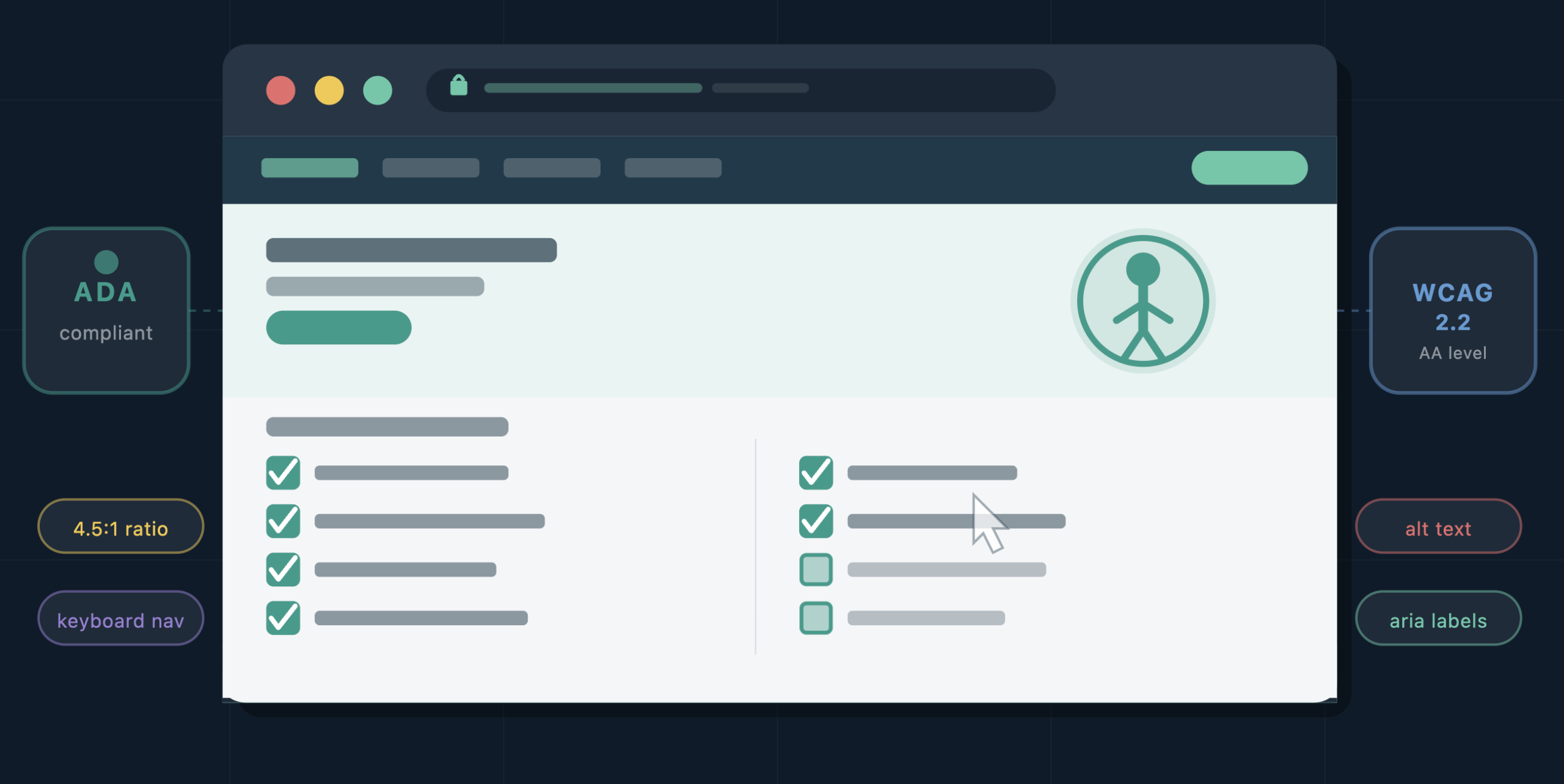
8 Simple Accessibility Best Practices You Can Apply Today
Accessibility isn’t just about compliance, it’s about usability for everyone. That includes:
- Users navigating with screen readers
- Visitors on mobile devices
- People with visual or cognitive differences
- Anyone trying to quickly find information
Here are the key areas to focus on when updating your website:
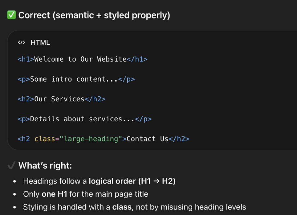
1. Use Clear Heading Structure
Screen readers and search engines both rely on your heading hierarchy to understand what a page is about and how it’s organized.
- Use one H1 per page (your main title)
- Use H2s and H3s to organize sections
- Avoid skipping levels (e.g., jumping from H1 to H4)
👉 Think of headings like an outline, not just styling.
2. Color Contrast: Make Sure Your Text Is Easy to Read
Accessibility guidelines require a minimum contrast ratio between text and background. This matters most for users with low vision or color blindness, but — if you’ve ever tried to read grey text on a white background on a bright day — you know it benefits everyone.
The most common places contrast slips: link colors on colored backgrounds, button text, footer copy, and text overlaid on images. Any time you update your color scheme or add a new banner, run it through WebAIM’s Contrast Checker — free and takes ten seconds.
Even subtle color changes can make a big difference in usability.
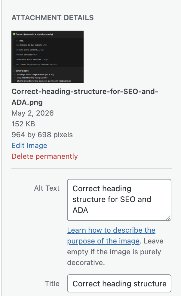
3. Add Meaningful Alt Text to Images
Alt text is the description attached to an image that screen readers read aloud. It’s also what search engines index when they can’t “see” your images — making it both an accessibility and SEO win.
Good alt text describes what the image communicates, not just what it shows:
- ✔ Good: “Download the 2024 grant application form”
- ✘ Not helpful: “Image of form”
4. Use Descriptive Text Links
Screen reader users often navigate a page by jumping between links. If every link says “Click here” or “Read more,” that navigation is meaningless.
Descriptive link text also matters for LLM-driven search: AI tools indexing your site use link text as signals for what a destination page contains. “Download our services brochure” gives far more context than “click here.”
Easy upgrades:
- “Click here” → “View our web design services”
- “Read more” → “Read our guide to ADA compliance”
Clear links improve both accessibility and SEO performance.
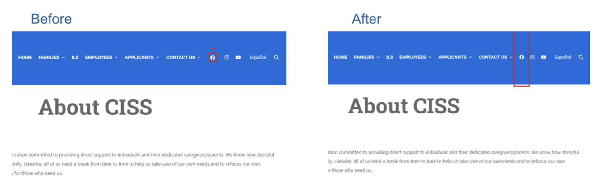
5. Make Buttons Easy to Click
Small buttons and tightly packed links create friction for users with motor disabilities, older users, and anyone on a phone. WCAG guidelines recommend interactive elements be at least 24–44px in both dimensions, with enough spacing between adjacent links that they aren’t accidentally triggered.
A button that looks fine in a mockup can be a tapping nightmare in real life. Worth a check any time you add new calls-to-action.
This improves usability for both desktop and mobile users.
6. Label Your Forms Clearly
Forms are one of the most common accessibility failure points — and the issue is almost always the same: placeholder text inside a field used instead of an actual label.
Placeholder text disappears the moment a user starts typing. Anyone who pauses mid-form, or who uses a screen reader, loses all context. Every field needs a persistent, visible label — whether that’s a contact form, checkout page, or newsletter signup.
Related read: If your site handles sensitive data, How to Make Website Forms HIPAA Compliant is worth a look alongside this one.
7. Keep Your Layout Consistent Across Pages
Navigation that changes between pages, shifting headers, and layouts that behave differently in unexpected ways all create disorientation — especially for users with assistive technology who build mental models of how a site works.
This tends to surface when teams create custom landing pages with unique structures, or when multiple people manage different sections of a site. If you have multiple contributors, make sure everyone’s working from the same structural template.
When things move unexpectedly, users can get lost quickly.
8. Don’t Forget About PDFs and Documents
Accessibility doesn’t stop at your website. If your site links to downloadable PDFs or Word docs, those files need to be accessible too. That means using proper heading styles when creating the source document and exporting in a way that preserves structure.
A PDF that’s just a scanned image, or one where headings were faked with bold text, will be unreadable to a screen reader. Review linked documents the same way you’d review a web page.
When uploading documents:
- Use proper heading styles
- Structure content clearly
- Export as accessible PDFs
This ensures all your content—not just your pages—is usable.
Accessibility + SEO + AI Search: Why This Matters More Than Ever
Accessibility best practices don’t just help users—they also help your visibility.
Search engines and AI-powered tools (like ChatGPT, Google AI Overviews, and voice assistants) rely on:
- Clear structure
- Meaningful content
- Well-labeled elements
In other words:
👉 Accessible content is easier to understand—and easier to surface in search results.
If your site is structured properly, it’s not just more inclusive—it’s also more discoverable.
The Bottom Line: Small Changes, Big Impact
You don’t need to overhaul your entire website to improve accessibility.
By consistently applying these small best practices, you can:
- Improve user experience
- Reduce risk
- Support a wider audience
- Strengthen your SEO and AI visibility
And most importantly—you create a website that works for everyone.
Need Help Keeping Your Site Accessible?
Accessibility can feel overwhelming, especially as your site grows. At NDIC, we help businesses:
- Audit and improve accessibility
- Implement best practices the right way
- Maintain compliance as content evolves
If you’d like a second set of eyes or help implementing any of these updates, we’re here to help.
👉 Contact us today and let’s make your website more accessible, usable, and future-ready.


Related Posts

AI-Driven Websites: Buzzword or Business Advantage
People throw the phrase "AI-driven website" around a lot lately,...
Why 301 Redirects Matter More Than You Think
Most business owners don't think about redirects until something breaks;...

Magento to WooCommerce Migration, Done Faster with AI
*"Magento™ and WooCommerce™ are trademarks of their respective owners. Most...

Your Website’s New AI Coworker: Are You Ready?
Most conversations about AI and websites focus on one of...