Responsive and Ready: The Importance of Mobile-Friendly WooCommerce Themes

The Mobile Commerce Revolution
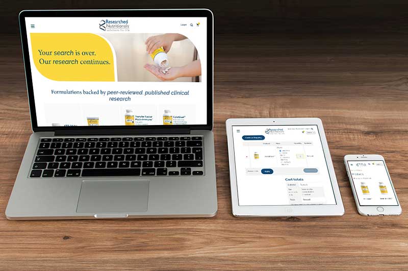
In the era of mobile dominance, an online store’s success is intrinsically tied to its mobile-friendliness. As users increasingly turn to smartphones for their shopping needs, having a responsive and mobile-friendly WooCommerce store is no longer an option. It’s a necessity. This comprehensive guide explores the critical importance of mobile-friendly WooCommerce themes/websites, looking at why they matter, how to choose them, and the impact they can have on your online business.
I. The Mobile Shift: Why Mobile-Friendliness is Non-Negotiable
1. Mobile Shopping Trends:
In recent years, mobile shopping has witnessed an unprecedented surge. Studies show that a significant percentage of e-commerce transactions now occur on mobile devices.
2. Google’s Mobile-First Indexing:
Google’s emphasis on mobile-first indexing means that websites optimized for mobile users receive preferential treatment in search rankings.
II. The Impact of Mobile-Friendly Themes on User Experience
1. Smooth Navigation:
Mobile-friendly WooCommerce sites and responsive themes ensure smooth navigation, providing an intuitive and enjoyable user experience on smartphones and tablets, no matter the size.
2. Improved Page Load Speed:
Mobile-friendly themes are designed for quick loading, reducing bounce rates and keeping impatient mobile users engaged.
3. Optimal Product Display:
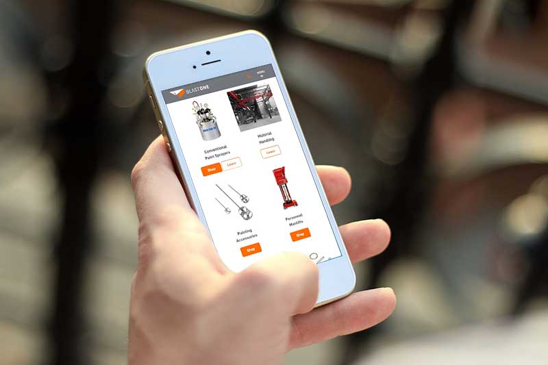
Responsive themes optimize product displays for smaller screens, making sure that your product or service looks appealing on any device.
III. Choosing the Right Mobile-Friendly WooCommerce Theme
1. Theme Responsiveness:
Make sure the theme is explicitly labeled as “responsive” to guarantee adaptability to various screen sizes. If you work with us, you know that our own NDIC theme is 100% responsive and we do Quality Assurance on the website we design before the Go Live.
2. Customization Options:
If you need something more customized, you can always let us know so we make sure to provide the most efficient solution for your business.
IV. Mobile SEO: Enhancing Visibility and Rankings
1. Google’s Mobile-Friendly Test:
Utilize Google’s Mobile-Friendly Test to make sure your WooCommerce store meets the search giant’s mobile standards.
2. Mobile SEO Best Practices:
Implement mobile SEO best practices, including concise meta descriptions, mobile-friendly URLs, and optimized images. If you are interested in getting an SEO report of your website, feel free to get in touch and we will gladly help you with one.
V. Impact on Conversions and Revenue: The Bottom Line
1. Reduced Cart Abandonment:
A mobile-friendly store experience reduces cart abandonment rates by providing a smooth and hassle-free checkout process for all users.
2. Increased Sales:
Enhanced user experience on mobile leads to increased sales and revenue as more users feel comfortable completing transactions on their devices.
Future-Proof Your WooCommerce Store with Mobile-Friendly Design
In the rapidly evolving e-commerce landscape, the importance of mobile-friendly WooCommerce themes cannot be overstated. By prioritizing mobile responsiveness, you not only enhance user experience and SEO rankings but also future-proof your online store against the ever-increasing dominance of mobile commerce.
Take the leap toward a responsive and ready WooCommerce store, and watch your business thrive in the mobile era.
Your Customers Are Mobile. Is Your Store? Connect with our team to make sure your WooCommerce theme is responsive and ready for the modern shopper.